Custom Logo Projector Light: Creative Ways to Showcase Your Brand
2026-10-23
A logo that just sits on a sign is easy to ignore. A logo that moves, glows, and adapts to your space is impossible to miss. That's the appeal of a custom logo projector light—and with TNT, it's not some complicated rig. It's a simple tool that opens up a whole new playbook for brand visibility. Below, we skip the obvious and dig into creative setups that actually make people stop and look.
Let Your Logo Dance Across the Room
A static logo is a wallflower at a party. It sits there, hoping to be noticed, while the room buzzes with movement and energy. But a logo that dances? That’s the one everyone remembers. It doesn’t just sit on a business card or a website header. It sways, spins, bounces across the screen, and pulls eyes toward it like a magnet. It doesn’t need a loud introduction—its motion is the introduction. The moment it appears, it’s already in the middle of the floor, inviting people to watch, smile, and lean in.
The idea isn’t about fancy animation for its own sake. It’s about making your brand feel alive. When a mark moves with intention—whether it’s a subtle slide, a playful tilt, or a full twirl—it tells a story. It says you’re not frozen in time. You’re present, responsive, and ready to engage. That kind of energy transfers to your audience. They don’t just see a shape; they feel a rhythm. And that rhythm sticks with them long after the screen goes dark.
So next time you think your logo is “fine” just sitting there, ask yourself: would you rather be the person standing against the wall, or the one dancing across the room? The answer is obvious. Let your brand move. Let it play. Let it dance. Because in a world full of still images, motion is the quickest way to make someone stop, watch, and remember your name.
Turn Foot Traffic Into a Brand Moment
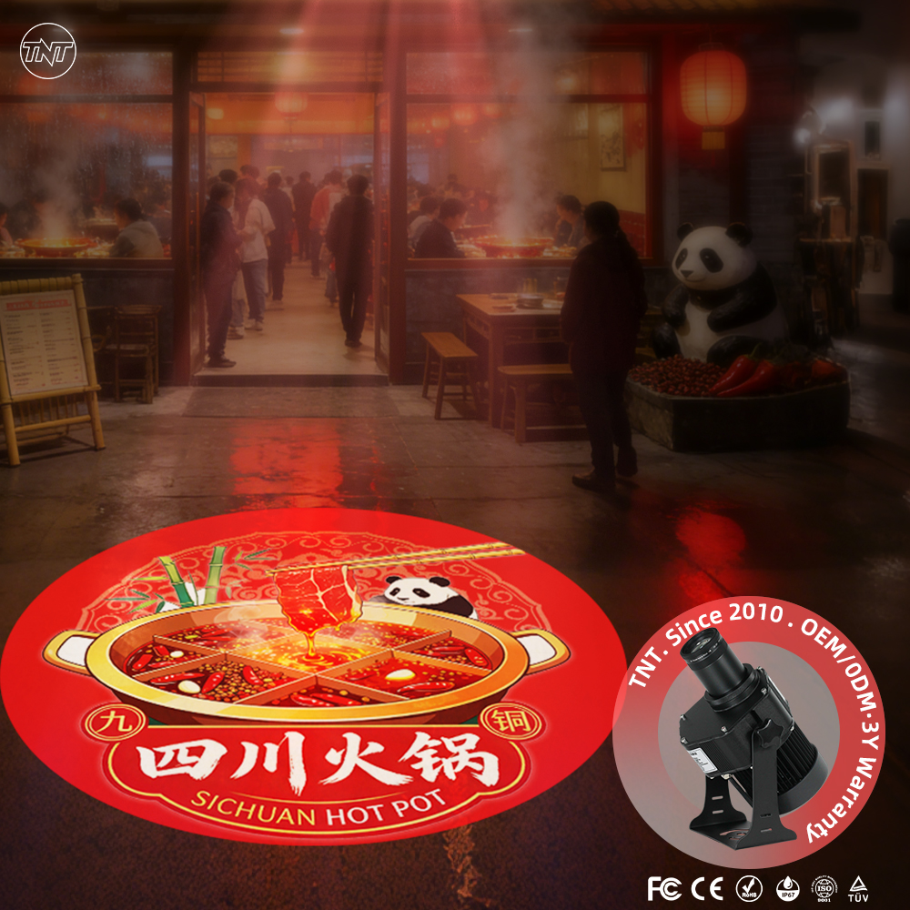
A storefront shouldn't just invite people inside; it should shift how they feel the moment they cross the threshold. That means treating the entryway, the first few steps, and the immediate sensory details as part of the product. A scent, a texture underfoot, a greeting that doesn't follow a script—these turn a passive walk-in into someone who is already experiencing the brand, not just browsing it.
The real opportunity sits in the unplanned moments. Instead of pushing a sale, give visitors something worth slowing down for: a demo station that invites touch, a corner with rotating local art, or a coffee bar that encourages a pause. When people leave with a small story to tell, the brand has done more than foot traffic—it has created a reason to return.
Consistency doesn't mean sameness. Train staff to read the room and react, not recite. Let music, lighting, and layout flex with the time of day or the mood of the crowd. That kind of attention signals that the brand is alive, and customers begin to see the space as a place where something interesting always seems to be happening.
Give Every Pop-Up a Personal Touch
Pop-ups often feel like a blunt instrument, but they don't have to. A little context goes a long way. Instead of greeting every visitor with the same tired discount code, try pulling in details you already have—like what they were browsing or where they're visiting from. A returning customer who left a pair of boots in their cart doesn't need a first-time buyer pitch; they need a nudge that says you noticed.
Even small adjustments change the tone entirely. Use their first name if you have it, but don't stop there. Match the imagery and wording to the page they're on. A pop-up on a blog post about winter coats should not look like one designed for summer dresses. When the message lines up with what the person is already thinking about, it stops feeling like an interruption and starts feeling like help.
And remember that personal does not mean overly familiar. Skip the fake enthusiasm and the exclamation marks. A calm, specific offer—like free shipping on the exact category they viewed—can outperform a loud generic sale. Test different triggers and watch how people respond. The goal is to make each pop-up feel less like a broadcast and more like a quick, useful note from someone who was paying attention.
Brand the Night at Your Next Launch
Your launch event isn't just a date on the calendar—it's a chance to leave your mark long after the lights dim. Think beyond the standard step-and-repeat backdrop. Project your logo onto nearby buildings, hand out custom glow bracelets that sync with the keynote beat, or design a signature scent that drifts through the room. When every sensory detail carries your brand, attendees don't just remember the night; they associate the feeling of it with you.
The trick is to blend bold branding with genuine interaction. Instead of plastering your name on every flat surface, create moments people want to capture and share naturally. A temporary tattoo station with your icon, a late-night snack bar where the packaging doubles as a collectible, or a photo wall that changes color as guests approach—these small surprises make your brand the life of the party without forcing it. The goal is that when someone posts a story at 1 a.m., your identity is woven into the fun, not stamped on top of it.
Finally, extend the energy beyond the venue. Send guests home with a small object that only reveals a hidden message under blacklight, or give them a code to unlock behind-the-scenes footage the next morning. Those quiet follow-up touches turn a single evening into a conversation that keeps going. Your launch isn't just an event; it's the beginning of a story people will retell with your name at the center.
Make Product Displays Impossible to Ignore
Most displays fade into the aisle because they follow the same visual rhythm as everything around them. To break that, pick one element and push it further than feels comfortable: an oversized color block behind a single item, a shelf turned at an unexpected angle, or lighting that throws long shadows across the product. The goal is not more brightness or more props. It is a deliberate contrast that makes a shopper slow down for a second look.
A display becomes impossible to ignore when it hints at a story rather than shouting a price. Give one hero product room to breathe on a pedestal or in a framed box, add a handwritten detail like a care card or a small note about its origin, and keep the surrounding props slightly mismatched in texture. Change that story every week or two. Repetition is the fastest way to make even a bold setup disappear into the background.
Set the Mood With Your Mark
The weight of a pen, the drag of a nib, the way ink settles into paper—these small physical details shape how a message lands before a single word is read. A thick, confident stroke can make a simple note feel like a declaration, while a thin, scratchy line turns the same sentence into something tentative, almost whispered. Choosing your mark is less about decoration and more about deciding what kind of presence you want to leave on the page.
Materials carry their own emotional weather. A fountain pen with a soft gold nib asks you to slow down, to let the ink pool and spread, creating a rhythm no ballpoint can match. A brush pen turns letters into gestures, each curve holding the memory of your hand's movement. Even a humble pencil, with its smudgable graphite, invites revision and intimacy—as if the thought is still breathing. None of these are right or wrong; they simply feel different in the reader's hand and eye.
So before you write, pause and ask: what mood do I want this mark to set? Formal and unwavering? Playful and loose? Introspective and quiet? Your tool is not just an instrument—it's a collaborator in tone. Match it to your intent, and the mark itself becomes part of the message, long before the first word takes shape.
FAQ
It's a compact fixture that throws a focused beam of light through a custom-etched lens or slide, projecting your logo, message, or graphic onto any surface. Unlike a regular gobo projector that uses interchangeable generic patterns, a custom version is built around your specific artwork, so the projected image is uniquely yours rather than a stock shape.
Think beyond the obvious wall behind a reception desk. Try projecting onto the floor just inside the entrance, onto a ceiling above a seating area, or even across a sidewalk outside your storefront. Elevator doors, stair risers, and product display tables also work surprisingly well because people aren't used to seeing branded light there.
Small businesses often get more impact per dollar because the effect feels personal and intentional. A neighborhood bakery projecting a subtle rolling pin icon onto the pavement at dusk, or a barbershop casting its name across a brick wall, creates a memorable stop-and-look moment that doesn't require a huge marketing budget.
Prioritize optical clarity over raw wattage. Look for a high-quality glass or metal gobo, not a thin plastic slide, and check that the lens is adjustable for focus. Metal housing with good heat dissipation matters more than you'd think, because overheating causes the image to drift or dim over time. Also ask for a sample projection photo before committing.
Strip it down to the essential shapes. Thin lines, small text, and gradients tend to disappear or bleed when projected, so use bold strokes, high contrast, and solid fills. If your logo has fine details, test them at the actual projection distance. Negative space can be your friend, since the light itself carries the visual weight.
Yes, and they're usually avoidable. Placing the projector where people have to stare directly into the beam is a quick way to annoy customers. Projecting onto a cluttered or uneven surface makes your logo look broken. Using an overly bright light in a dim, intimate space can feel aggressive. And forgetting to clean the lens turns a sharp image into a dusty smudge.
Outdoor use is possible, but you need a fixture rated IP65 or higher for rain and dust protection. Also pay attention to the operating temperature range, because extreme cold can make some internal components sluggish. If you live in a snowy or coastal area, choose housing with corrosion-resistant coating and clean the lens regularly to remove salt or ice buildup.
Conclusion
A custom logo projector light is less like a sign and more like a stage effect. Instead of pinning your brand to one flat panel, it lets the mark roam freely—drifting across a ceiling, sweeping over a floor, or pulsing gently to a beat. That movement stops people mid-conversation. In a storefront, a shifting logo on the sidewalk or window works better than any open sign; it turns ordinary passersby into curious visitors before they even decide to step inside. At a product launch, you can train the beam on a single item, letting your logo melt into the packaging or hover above it like a halo. The result is a display that refuses to be background noise, pulling every eye in the room toward the one thing you want them to remember.
Pop-up events thrive on details that feel bespoke rather than borrowed. A projector lets you stamp a blank wall or draped fabric with a mark that shifts and breathes, giving the whole space a temporary personality. When the sun goes down, the light takes over the room's mood—soft amber for an intimate preview, electric blue for a high-energy launch, or slow fades that match your brand's rhythm. It's the kind of touch that makes guests feel they walked into something made just for them, not a rented hall with a banner. Over the course of an evening, the projector can move from highlighting a new product to washing the entire floor in your color, turning the venue itself into an extension of your brand story. People leave with the image lingering, not because it was loud, but because it was everywhere and nowhere at once.
Contact Us
Contact Person: TNT SALE
Email: [email protected]
Tel/WhatsApp: 8613544277910
Website: https://www.tntprojector.com/