

Cosmetic Bottles Service: A Complete Guide for Beauty Brands
2026-08-16
In the crowded beauty market, your product’s first impression often comes from its bottle—the weight in hand, the smoothness of the pump, the quiet luxury of a well-designed cap. Yet behind every standout package is a partner who understands that cosmetic packaging is more than just a container. Zhejiang Haitong Plastic Industry Technology Co., Ltd. has spent years perfecting that balance between form and function. This guide walks you through the essential services, materials, and design choices that can elevate your brand—so your packaging does the selling before a single drop is used.
How Your Bottle Shapes the First Impression
A bottle is rarely just a container. Before a single drop is poured, its silhouette, weight, and texture have already whispered something about what’s inside. A slender neck and heavy base might suggest ceremony, while a squat, soft-edged form hints at casual comfort. Even the way a label sits against the glass — slightly off-center, deliberately minimal, or proudly detailed — tells a story that no tasting note can replace.
Think of the moment someone passes you a bottle across a table. You notice the coolness of the material, the resistance of the cap, the faint sound it makes when set down. These micro-impressions stack up fast. A bottle with a cork that requires a firm pull, for instance, can feel more artisanal than one with a twist-off, regardless of what’s actually inside. That first tactile meeting often sets the emotional tone for the entire experience.
This is why so many small producers obsess over shape, color, and closure long before they finalize the liquid. They know that a distinctive bottle can turn a passing glance into a pause, and a pause into a conversation. The liquid may be the reason for the purchase, but the bottle is the reason for the reach.
Glass, Plastic, or Something Else? Materials That Match Your Brand's Personality
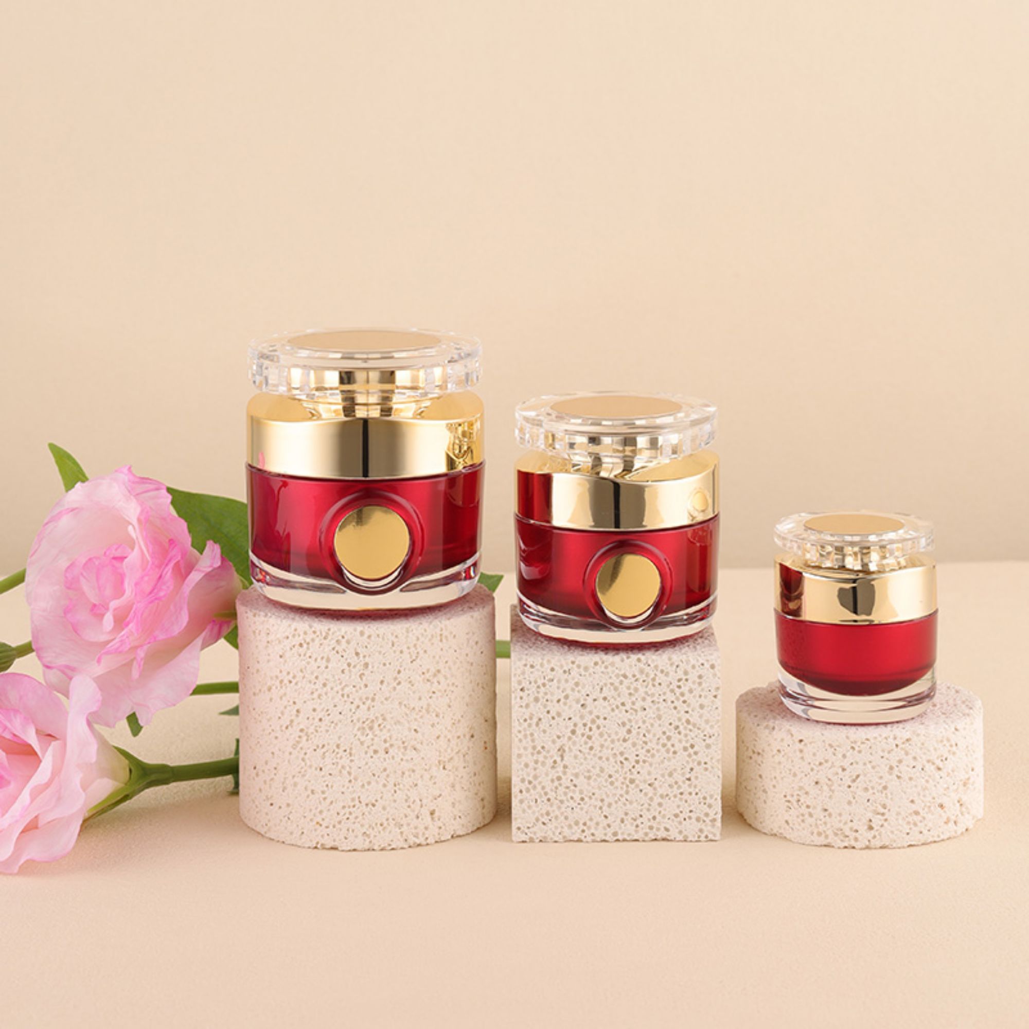
When you hold a product in your hands, the first thing you notice isn't the logo or the label—it's the material. Glass communicates transparency, fragility, and a quiet confidence. A brand that chooses glass is saying, "We have nothing to hide, and we're willing to be a little more careful." Plastic, on the other hand, is the chameleon of materials. It can be molded into almost any shape, colored in endless ways, and made to feel soft or hard. But that versatility comes with a connotation of disposability, which can either reinforce a youthful, energetic brand or drag down one that promises longevity.
Then there are the less obvious choices—metals, wood, even stone. A brushed aluminum container suggests precision and industrial strength, perfect for a tech gadget or a high-end skincare line. Wood evokes warmth and craftsmanship, ideal for artisanal foods or natural cosmetics. Ceramic lends a sense of permanence and tradition, while uncoated paper feels humble and eco-conscious. The common thread is that each material carries an unspoken story, and consumers pick up on it whether they realize it or not.
The key is to match the material not just to your product's function, but to your brand's core personality. A rugged outdoor brand might lean into recycled plastics and matte metals. A boutique bakery might choose glass jars and kraft paper. Think about the gesture your packaging makes: does it invite reuse, or is it meant to be torn open and tossed? That gesture, more than any logo, tells people who you are.
Custom Finishes That Feel Expensive Without the Luxury Price Tag
The appeal of a custom finish is undeniable—it signals a space that has been thoughtfully considered, not just decorated. But you don't need a designer budget to get that layered, high-end look. Techniques like hand-applied limewash, subtle color washing, or using a dry-brush method on trim can mimic the depth of expensive plaster or aged wood for a fraction of the cost.
Start by rethinking materials you already own. A plain pine dresser can be transformed with a custom stain blend or a matte furniture paint topped with a soft wax. Swap standard cabinet knobs for vintage brass or hand-forged iron pieces found at salvage yards or online marketplaces—these small details read as bespoke without a bespoke bill.
The real magic happens in the finishing touches. Instead of defaulting to uniform paint, try a two-tone approach on doors or a subtle metallic glaze on moulding. Even mixing your own paint color by combining leftover samples creates a shade no one else has, giving the room a tailored feel that guests assume cost far more than it did.
Minimum Orders and Lead Times: Planning Around the Fine Print
Minimum order quantities often look straightforward on a supplier's website, but the real number can shift once you factor in colorways, sizes, or packaging variations. Some factories quote a low MOQ for a single style, then quietly require that each variant meets the same threshold—turning a 300-unit order into 1,500 pieces before you blink. Ask for a breakdown of how MOQs apply across SKUs, and confirm whether the stated minimum is per order, per item, or per production run.
Lead times have their own fine print. A 30-day production window might start only after sample approval, deposit receipt, and material sourcing—adding two or three weeks to the calendar. And if you place a reorder, don't assume the same timeline applies; raw material availability and factory scheduling can stretch it considerably. Build in buffer days and ask for a written production schedule that pinpoints when each stage begins, rather than relying on a vague 'ready to ship' date.
Regulatory Landmines in Cosmetic Packaging—and How to Sidestep Them
Cosmetic packaging might look like a straightforward mix of glass, plastic, and ink, but underneath the surface lurk regulatory traps that can stall a launch or trigger a costly recall. One of the trickiest areas is the use of recycled materials—many brands rush to tout post-consumer resin without realizing that certain jurisdictions require migration testing to prove no harmful contaminants leach into the product. A “green” claim on the label can quickly backfire if the local authority demands documentation you never thought to keep.
Another frequent misstep involves label space and readability. The EU’s Cosmetics Regulation mandates a minimum font size for ingredient lists, while the US FDA expects net quantity declarations in both metric and imperial units. Trying to squeeze all that onto a tiny lipstick tube often leads to creative but non-compliant formatting—like shrinking the batch code or hiding the responsible person’s address in a fold-out leaflet. Regulators notice these shortcuts, and so do consumer watchdogs.
Perhaps the most overlooked hazard is the interaction between the product formula and the packaging itself. A preservative system that works perfectly in a lab beaker can degrade when exposed to certain plastics or metal closures, altering the formula’s stability and safety profile. Smart brands sidestep this by running compatibility tests early—not just for the primary container but for every cap, liner, and pump component. Documenting those tests, along with a clear change-control log for any packaging tweak, turns a potential minefield into a manageable checklist.
Sustainable Packaging That Actually Sells, Not Just Sounds Good
Most shoppers don't buy a product because the packaging says it's sustainable. They buy because the package feels deliberate. A mailer made from 70% recycled fiber still has to arrive uncrushed, open without a knife, and look like someone thought about the unboxing before the photo op. When those details hold up, the lower-impact material stops being a footnote and starts being part of why the product earns its place in the cart.
The brands that get this right tend to do less explaining and more showing. A subtle emboss instead of a four-color print job. A single line on the flap: 'Made with 62% post-consumer waste, printed with soy-based ink.' No leaf icons crowding the side panel. That restraint reads as confidence, and confidence is what tips a hesitant buyer from 'maybe' to 'yes.'
There's a practical side too. Smaller boxes weigh less and cost less to ship. Fewer layers mean faster packing on the line. When the sustainable option also saves money, the brand can afford to keep prices steady or invest in better materials next time. That's the real trick: packaging that sells without making the customer feel like they're being sold a virtue.
FAQ
Look beyond the catalog and ask about material expertise, custom finish capabilities, and whether they can handle the full journey from design to filling. A supplier that understands cosmetic formulas will flag issues like incompatibility with certain plastics or pump mechanisms before they become production problems.
Glass is chemically inert and works well for active ingredients, but it is heavier and more fragile. PET is lightweight and less likely to shatter, yet it can allow some oxygen transfer over time. For oxygen-sensitive serums or vitamin C products, choose bottles with barrier coatings or thicker wall structures.
Yes, many services now offer low minimum order quantities and modular design systems. Instead of opening a brand new mold, you can start with a stock bottle shape and add custom silk screening, hot stamping, or a colored spray finish to create a distinctive look on a smaller budget.
The weight, texture, and closing mechanism of a bottle influence how customers judge quality before they even try the formula. A heavy base, a soft-touch matte coating, or a magnetic cap can communicate luxury more effectively than a complex label design alone.
Use mono-material structures that are easier to recycle, reduce the number of separate components, and offer refillable formats. For decoration, replace traditional electroplating with laser engraving or water-based inks, and consider lightweighting the bottle walls while keeping the outer dimensions unchanged.
Common issues include sample-to-production drift, delayed shipments, and transit damage. Prevent these by agreeing on an Acceptable Quality Limit before production, requesting a pre-production sample, specifying inner packaging and carton drop tests, and working with a supplier that has local quality inspection partners.
Conclusion
Beauty brands often underestimate how much the bottle itself does before a single drop gets tested. The silhouette, weight, and even the way a cap clicks shut create an immediate impression that either elevates the formula or works against it. Choosing between glass and plastic isn't just about cost—glass can signal ritual and purity, while PET or acrylic might suit a playful, travel-friendly line. What really closes the gap between mass-market and premium is the finish: soft-touch coatings, brushed metal collars, or tinted transparency can feel far more expensive than the unit price suggests. Pair those choices with realistic planning around minimum order quantities and lead times so the launch date doesn't slip while you're chasing the perfect shade.
The less glamorous side of bottle selection is where mistakes get expensive. Cosmetic packaging rules vary by market, and overlooking things like material safety, label space, or recyclability claims can stall a shipment or trigger a costly redesign. Instead of treating compliance as a checklist, treat it as part of the design brief from day one. Sustainability also needs more than a green label—buyers are getting better at spotting vague promises. A refillable jar, mono-material pump, or easily separable components can become a genuine selling point when the messaging is specific and the convenience holds up. In the end, a complete bottle service means aligning shape, material, finish, and compliance so the package works as hard as the product inside.
Contact Us
Contact Person: Kara Yang
Email: [email protected]
Tel/WhatsApp: 8618857568397
Website: https://www.haitongplastic.com/