China Wine Packaging Box Designs That Make Every Bottle Feel Like a Gift
2026-11-20
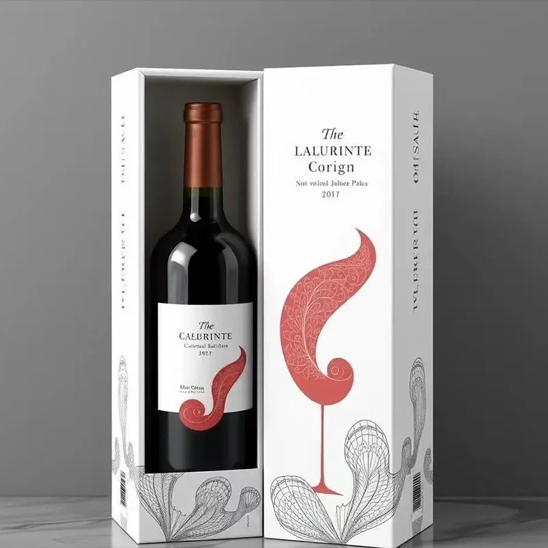
There’s a quiet moment before the cork pops—when the box still holds its secret and the wine feels less like a purchase and more like a promise. In China, that moment is being redesigned. From embossed textures that echo vineyard hills to magnetic closures that snap with quiet confidence, wine packaging has stopped being an afterthought. It’s now the first tasting note. At Zemeijia, we’ve watched this shift turn ordinary bottles into keepsakes, and gift-giving into a ritual. But what actually makes a box feel like a gift before the wine is even poured? Let’s look at the details that are changing how Chinese wineries—and the people who love them—think about the first impression.
The First Impression Is the Box, Not the Bottle
People often say never judge a book by its cover, but shelves tell a different story. The box is the first thing your hands reach for, the first surface your eyes scan, and the first signal of what might be waiting inside. A bottle can be elegant, sure, but it sits hidden behind cardboard until someone decides the outer layer is worth the effort. That split-second decision happens in the store, at the doorstep, or even in a warehouse before the product ever reaches a shelf. The box carries the promise, and if that promise looks generic or rushed, the bottle never gets a chance to speak.
Think of the box as a handshake before a conversation. It establishes tone, hints at quality, and sets expectations without a single word from the product itself. A sturdy, well-designed box suggests someone cared enough to protect what is inside. A flimsy or cluttered one plants doubt before the lid is lifted. This is why packaging design is rarely just decoration; it works like a quiet negotiation. The box says, "This is worth your attention," and the buyer decides whether to believe it. The bottle can only confirm that belief later, which means the outer layer carries a heavier load than most people realize.
In a crowded market, the box does the job of a front door. It either invites people in or makes them walk past. The same liquid in two different boxes can feel like two different products, one carefully crafted and the other forgettable. That gap exists entirely in packaging. So the next time a box feels overdesigned, remember it is not just protection or branding. It is the first impression doing its only job: earning a few seconds of trust before anyone even touches the glass.
Red Lacquer, Reimagined
Lacquer has always demanded patience, but the newest interpretations don't treat that slowness as a constraint. Layers are built up, sanded back, and deliberately interrupted, so the red shifts from glassy opacity to something closer to worn enamel. The surface keeps a memory of the hand that made it.
Color is moving away from the predictable lacquer red. Some studios now mix crushed mineral pigments into the sap, pulling the hue toward rust, oxblood, or a dry cinnabar that turns almost brown in low light. Others introduce a matte ground beneath the gloss, which makes the shine feel like light moving over a still pool.
The forms, too, have loosened. Instead of confining lacquer to boxes and trays, makers are applying it to curved panels, small architectural details, and furniture edges where the coating becomes a line rather than a field. Red, once reserved for ceremonial weight, now reads as intimate and slightly unsettled.
Magnetic Closures and Other Small Theater
There is something quietly satisfying about a flap that shuts with a decisive little snap. Magnetic closures deliver that small moment of certainty without the scratch of zipper teeth or the fuss of a turn lock. A well-placed magnet holds a panel down just firmly enough, and opens without a wrestling match.
Beyond handbag hardware, these fittings appear in places you might not notice until they are gone: slim folios, travel wallets, glasses cases, even the hidden pocket inside a jacket. The real trick is not just strength but position. A magnet that sits a fraction too high or too low will let a corner lift, while one set into a slight recess keeps everything flush.
Small hardware like this rarely gets attention, yet it shapes how an object feels in daily use. The best versions sit hidden behind lining or a thin layer of leather, doing their job without turning the design into a hardware display.
Paper Textures That Mimic Silk
A silk-like paper rarely announces itself through shine. It shows up as a soft, almost powdery glide under the fingertips, with light breaking across the surface in a diffused haze rather than a hard reflection. The tactile coolness is part of the effect, too, similar to running a thumb across the grain of real silk.
Mills achieve this by pairing long cotton or linen fibers with mineral coatings and repeated calendering. The goal is not to make the stock slippery, but to give it a dense, even surface that moves quietly and resists catching on dry skin. Some sheets are given a subtle emboss after coating, which interrupts the light just enough to suggest woven threads.
In finished pieces, that surface changes how people handle the object. Boxes get opened more slowly, book covers hold warmth from the hand, and printed colors seem to sit inside the sheet rather than on top of it. The paper stops being a background and becomes part of the touch.
When Wine Packaging Borrows from Mooncake Rituals
Somewhere between a Bordeaux gift set and a Mid-Autumn mooncake box, a quieter packaging shift has taken shape. Wineries are adopting the layered, lidded cartons once reserved for dense lotus seed paste and salted yolks. The box opens with the same slow, deliberate lift, often fitted with a magnetic clasp or a small fabric tab. Inside, the bottle rests in a moulded slot, flanked by compartments that feel less like industrial foam and more like the cushioned nests found beneath a row of mooncakes.
The real borrowing is in the rhythm of unboxing. Mooncake packaging has long understood that the first impression is not the pastry itself but the sequence of unwrapping, sliding out a drawer, folding back waxed paper, and finding a hidden utensil tray. Wine versions now follow that logic. Some boxes include a foil cutter, a two-prong cork pull, or a slim vial of the same vintage. Others leave an empty card slot, as if anticipating a note that will be read before the bottle is ever opened. These details slow the recipient down just enough to turn gifting into a minor ceremony.
There is also a cultural echo in the materials. Deep reds, gold foiling, and silk-textured liners once signalled prosperity in mooncake gift culture; now they appear on wine cartons aimed at holiday hosts and corporate givers. The box often outlives the bottle, repurposed for jewellery, tea sachets, or keepsakes. That longevity matters because it keeps the winery's name in a drawer or on a shelf long after the cork has been pulled. What wine takes from mooncake rituals, then, is not just structure but a sense of occasion that lingers in the object left behind.
Gift-Ready Details That Feel Personal
A handwritten note tucked under the ribbon, a monogram stamped in the corner, or a small keepsake that only makes sense between the two of you—these are the touches that turn a well-chosen gift into a memory. The goal isn't more stuff; it's a quiet signal that you noticed what someone actually reaches for, rereads, or saves.
Look for ways to match the detail to the person rather than the occasion. A friend who travels light might appreciate an understated leather tag with her initials, while a homebody may care more about the texture of the wrapping paper than the label on the box. Even the way the layers open can feel intentional—tissue folded with a pressed flower, a card placed exactly where the eye lands first.
The best gift-ready details don't announce themselves. They work in the background: a ribbon that echoes the color of their kitchen, a gift bag they'll reuse, a small note that references an inside phrase instead of a generic greeting. When the wrapping feels as considered as the present itself, the whole thing reads less like an exchange and more like a conversation.
FAQ
They are often built with the same attention as a jewelry case: layered materials, hidden magnetic closures, and interior fittings that hold the bottle in place. The box is meant to stay in the home long after the wine is gone, storing keepsakes or serving as a display piece.
Matte rigid board, textured linen, bamboo veneer, and soft suede or velvet linings are common. Some boxes use lacquered wood or embossed paper that mimics silk brocade, giving the surface a depth that glossy cardboard rarely achieves.
Instead of printing dragons everywhere, many use abstract references such as the geometry of window lattices, the grain of handmade paper, or the negative space found in ink paintings. Color is also restrained—deep indigo, cinnabar, celadon, or muted gold—so the reference feels modern rather than decorative.
Magnetic side panels that swing open like doors, ribbon pulls that lift the bottle from a molded cradle, and double-layer compartments for accessories are common. The reveal is usually slowed down deliberately, with a soft resistance that makes the box feel engineered rather than simply folded.
In many formal occasions, the presentation matters as much as the item itself, so boxes are designed to be carried and handed over without an extra bag. Sturdy handles, protective corners, and a relatively compact footprint are practical choices that also signal respect for the recipient.
Yes. Some workshops use recycled paper pulp molded into sculptural forms, natural soy-based inks, and removable fabric wraps instead of foam. The perceived value shifts from heavy embellishment to texture and proportion, which can feel even more thoughtful than a glossy laminated box.
Start with the moment of handing it over: the weight, the sound of the closure, and whether it can be opened without damaging the box. Then choose one strong tactile detail—like a carved wooden tag or a silk pull—rather than layering multiple decorative effects, because restraint often reads as higher quality.
Conclusion
Before anyone reads the vintage or grape variety, the box has already done most of the talking. In China’s wine gift market, packaging is treated less as protection and more as a form of address. The weight of the board, the resistance of a magnetic flap, the faint scent of ink and lacquer all arrive before the bottle appears. Red lacquer remains a familiar starting point, but many studios have stripped it of its high-gloss shine, replacing it with matte oxblood, crackled textures, or edges tinted like worn cinnabar. The goal is not loud display. It is the kind of object you hesitate to open too quickly. Magnetic closures add a pause, a low click, a sense that something private is being handed over.
Texture plays an outsized role. Papers are embossed until they resemble raw silk or the inside of a good coat, and some inserts take their logic from mooncake boxes, where every item sits in its own cushioned compartment. Ribbon pulls, blind embossing, a small blank card, or a seal that must be broken all shift the experience from transaction to ritual. These details are not decorative afterthoughts. They make the recipient feel the gift was assembled for a specific person, on a specific day, with a specific relationship in mind. By the time the bottle is lifted out, the wine has already become a gift in the older sense: something carried, wrapped, and offered with care.
Contact Us
Contact Person: Sasha Du
Email: [email protected]
Tel/WhatsApp: +86 13869836645
Website: https://www.zmjpackagings.com/